Plotting methods
First of all, you can use the methods mdaplot() and mdaplotg() (or any others, e.g. ggplot2) for easy visualisation of the results as they are all available as matrices with proper names, attributes, etc. In the example below I create scores and loadings plots for PC1 vs PC2. Here I assume that the model from previous section is already created and available in your Global Environment. As you can see, I take the matrix with scores from the objects with calibration results (m$res$cal).
par(mfrow = c(1, 2))
mdaplot(m$res$cal$scores, type = "p", show.labels = TRUE, show.lines = c(0, 0))
mdaplot(m$loadings, type = "p", show.labels = TRUE, show.lines = c(0, 0))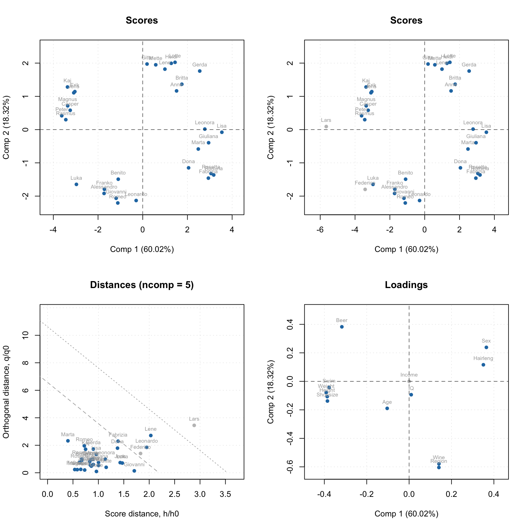
To simplify this routine, every model and result class also has a number of functions for visualization. Thus for PCA the function list includes scores and loadings plots, explained variance and cumulative explained variance plots, eigenvalues, distance plots, and many others.
A function that does the same for different models and results always has the same name. For example, plotPredictions will show predicted vs. measured plot for PLS model and PLS result, and so on, although the plot itself will be quite different. The first argument must always be either a model or a result object.
The major difference between plots for model and plots for result is as follows. A plot for result always shows one set of data objects — one set of points, lines or bars. For example, predicted vs. measured values for calibration set or scores values for test set and so on. For such plots method mdaplot() is used and you can provide any arguments, available for this method (e.g. color group scores for calibration results, add confidence ellipses for scores, etc.).
And a plot for a model in most cases shows several sets of data objects, e.g. predicted values for calibration and validation. In this case, a corresponding method uses mdaplotg() and, therefore, you can adjust the plot using arguments described for this method.
Here are some examples for results:
# create a factor for combination of Sex and Region values
g1 <- factor(people[, "Sex"], labels = c("M", "F"))
g2 <- factor(people[, "Region"], labels = c("S", "M"))
g <- interaction(g1, g2)
par(mfrow = c(2, 2))
# scores plot for calibration results colored by Height
plotScores(m$res$cal, show.labels = TRUE, cgroup = people[, "Height"])
# scores plot colored by the factor created above and confidence ellipses
p = plotScores(m$res$cal, c(1, 2), cgroup = g)
plotConfidenceEllipse(p)
# distance plot for calibration results with labels
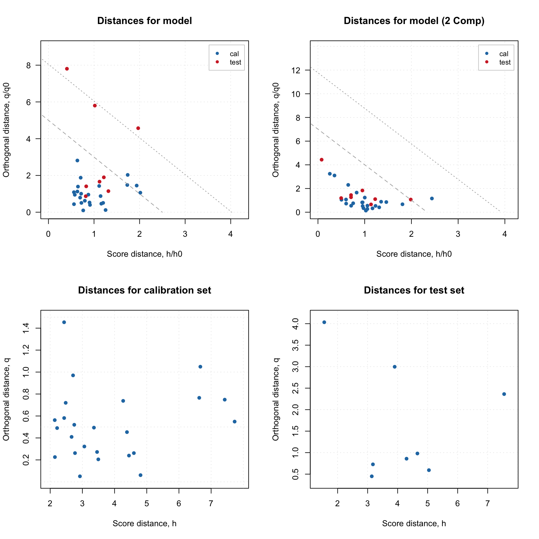
plotDistances(m$res$cal, show.labels = TRUE)
# variance plot for calibration results with values as labels
plotVariance(m$res$cal, type = "h", show.labels = TRUE, labels = "values")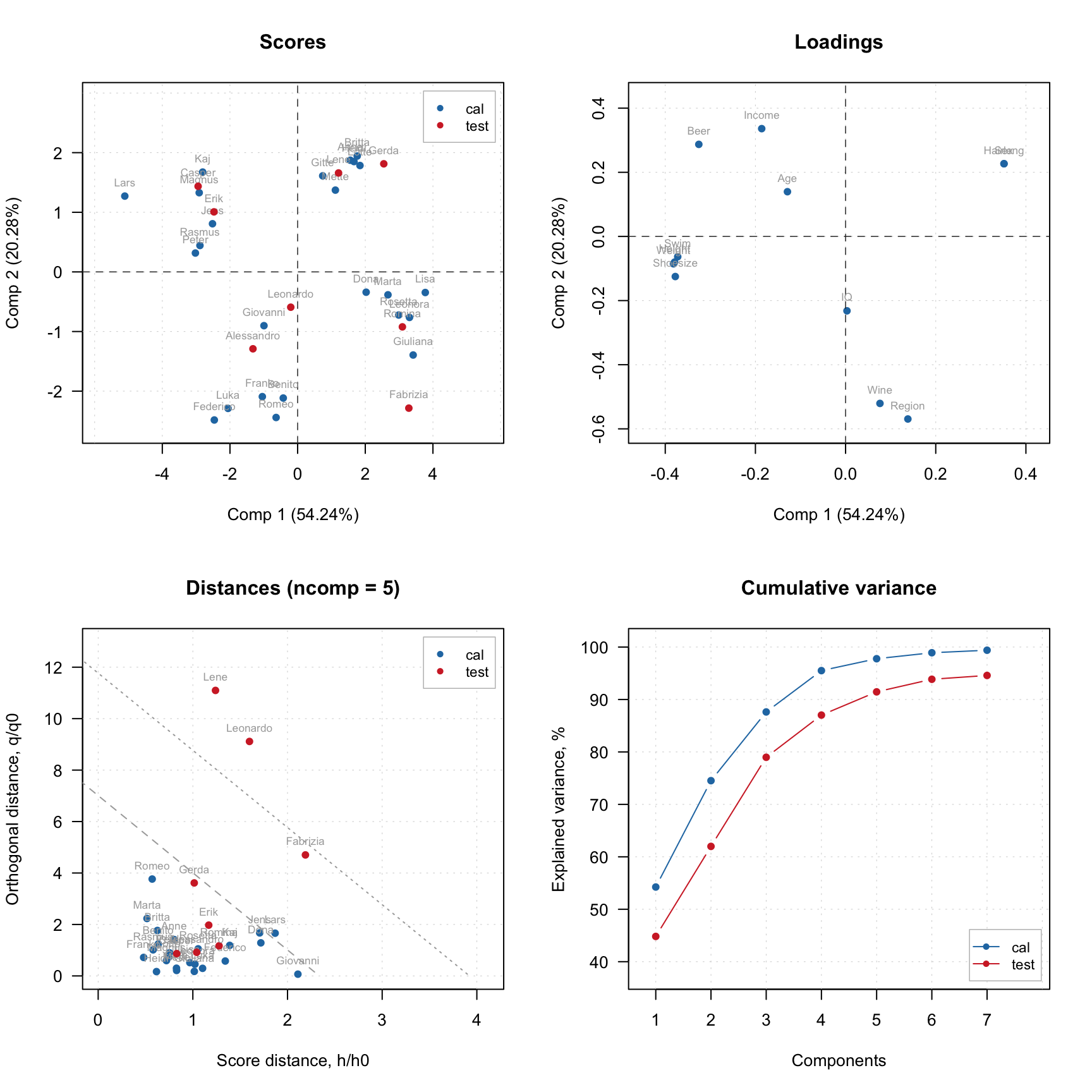
Notice that the distance plot in this case is shown using 5 PCs in the model. The model was calibrated using 7 components, but since we later selected 5 as optimal, it remembers this selection. You can also show this plot for any number of components between 1 and 7 by providing corresponding argument, e.g. ncomp = 3.
Scores plot can also be used together with plotHotellingEllipse() function. It works similar to plotConfidenceEllipse() or plotConvexHull() however does not require grouping of the values. You can add the ellipse both to score plot for results and score plot for model. In case of model, if you have e.g. both calibration and test set results you need to specify which one you want to use for creating the ellipse. Code below shows several examples.
par(mfrow = c(1, 2))

# default options for calibration results
p = plotScores(m$res$cal, xlim = c(-8, 8), ylim = c(-8, 8))
plotHotellingEllipse(p)

# also for calibration results but with specific significance limit and color
p = plotScores(m$res$cal, xlim = c(-8, 8), ylim = c(-8, 8))
plotHotellingEllipse(p, conf.lim = 0.9, col = "red")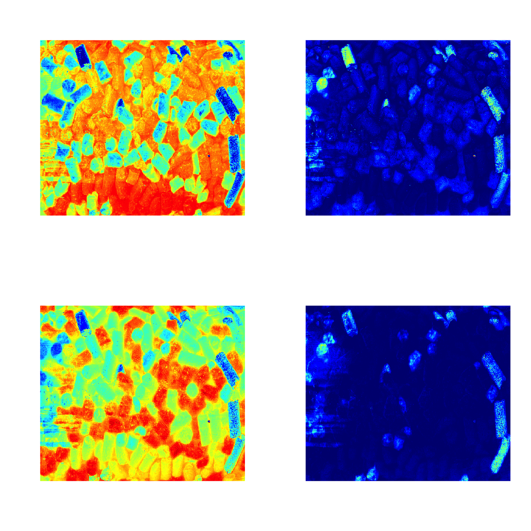
Now let’s look at similar plots (plus loadings) for a model.
par(mfrow = c(2, 2))
plotScores(m, c(1, 3), show.labels = TRUE)
plotLoadings(m, c(1, 3), show.labels = TRUE)
plotDistances(m, show.labels = TRUE)
plotVariance(m, type = "h", show.labels = TRUE, labels = "values")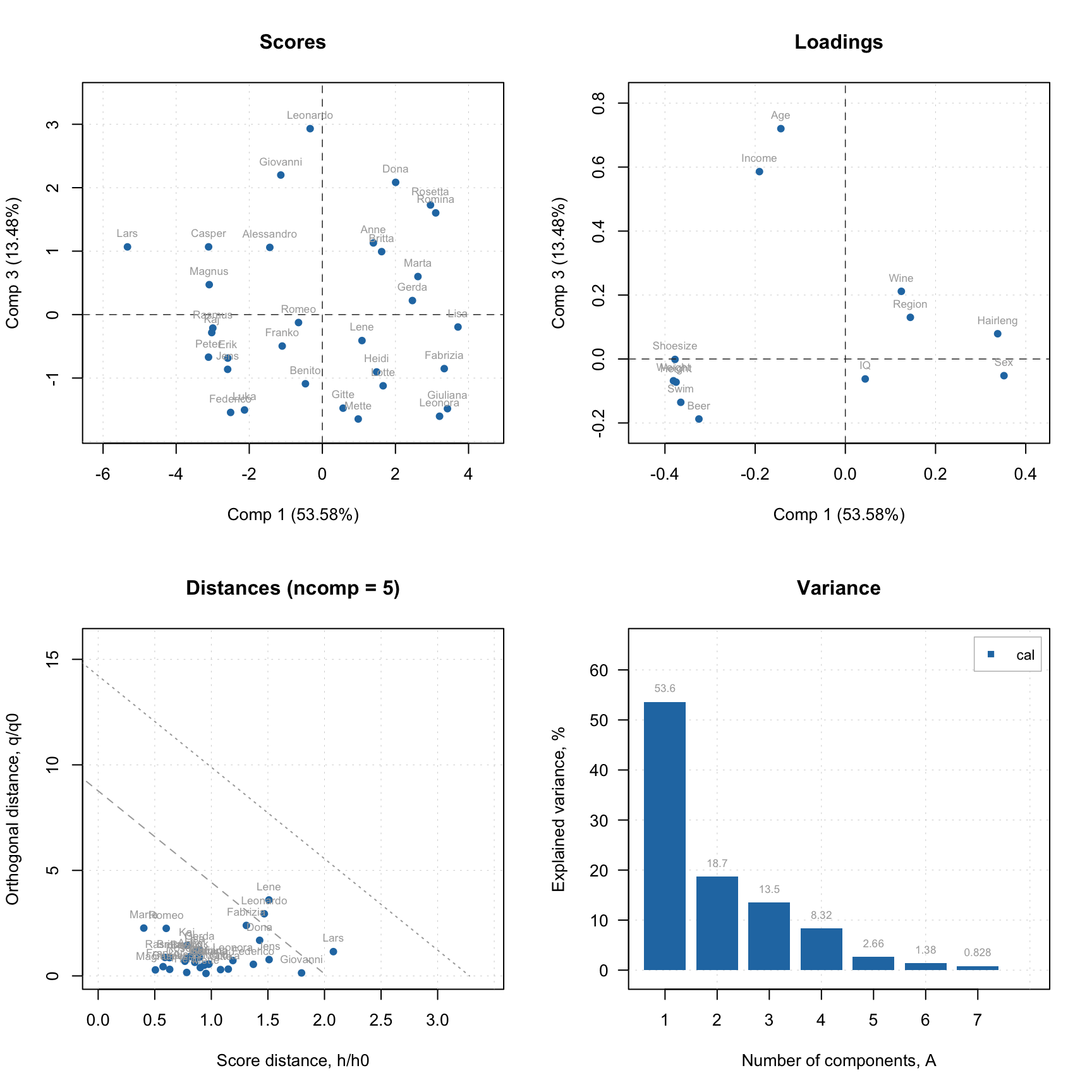
As you can see, in case of model, the distance plot also shows some lines. These are critical limits, all details about them as well as how to use the distance plot will be given in one of the next sections.
The variance can be plotted in two forms: individual (how much every component explains) or cumulative (how much is explained by this component and all previous together). Here is an example:
par(mfrow = c(2, 2))
plotVariance(m, type = "b", show.labels = TRUE, labels = "values")
plotVariance(m, type = "h", show.labels = TRUE, labels = "values")
plotCumVariance(m, type = "b", show.labels = TRUE, labels = "values")
plotCumVariance(m, type = "h", show.labels = TRUE, labels = "values")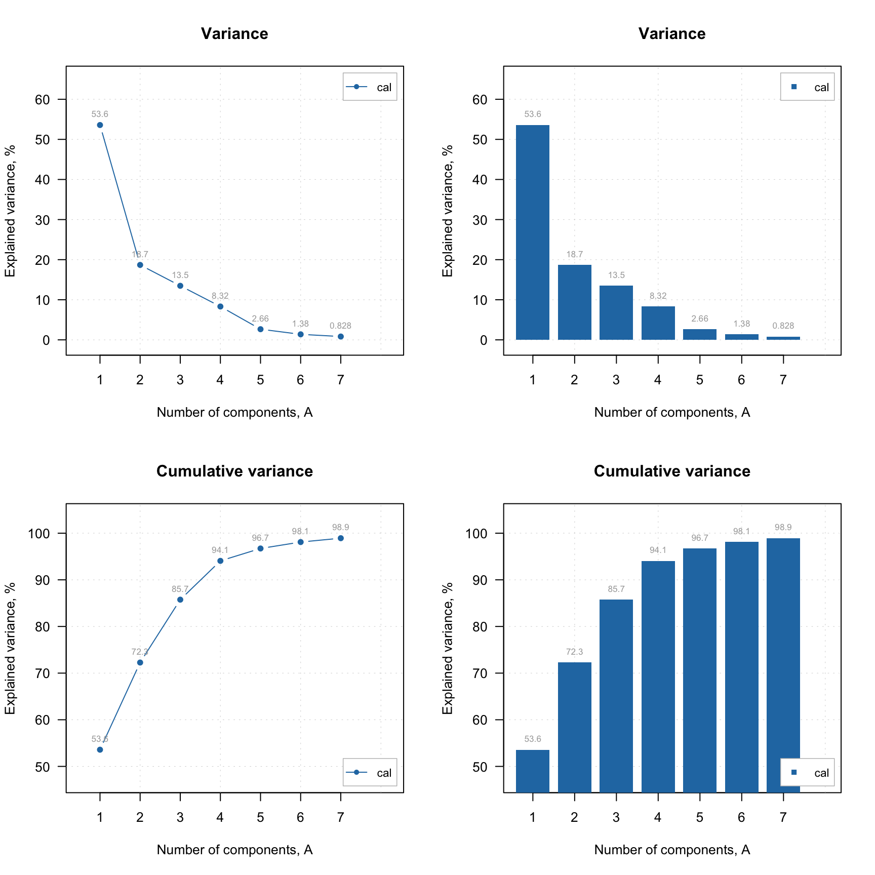
There is also a possibility to plot model’s eigenvalues vs. number of components, either raw or transformed using log or sqrt transformation:
par(mfrow = c(1, 2))
plotEigenvalues(m, type = "h", show.labels = TRUE, labels = "values")
plotEigenvalues(m, type = "b", transform = "log")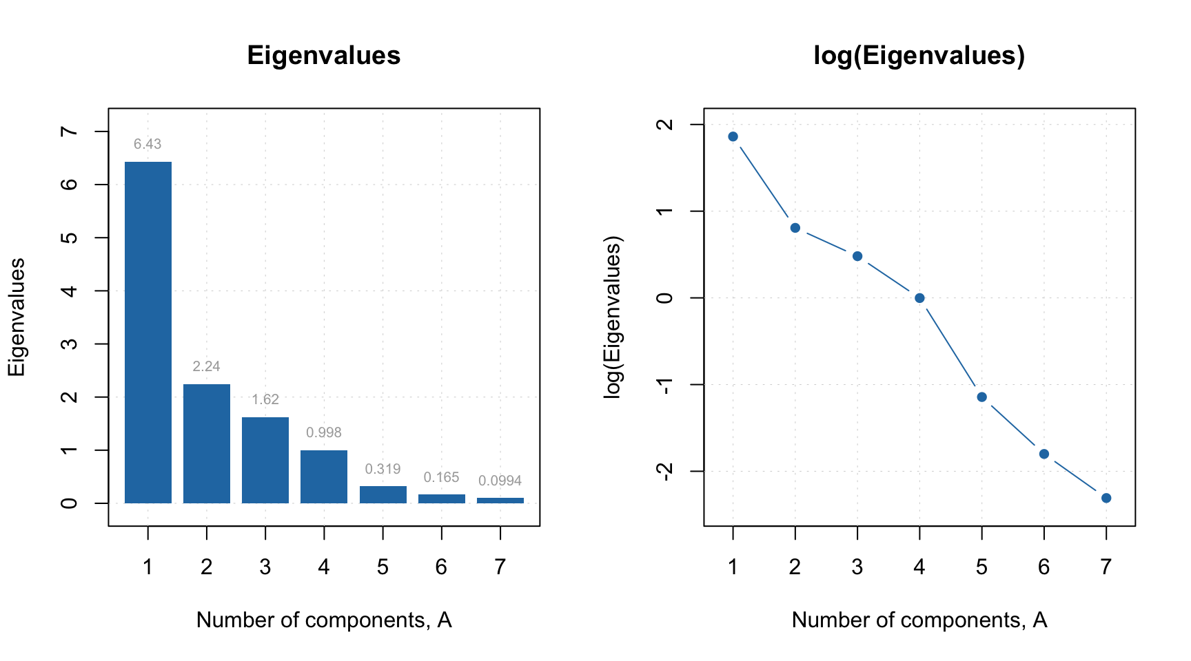
If model plot shows values from calibration and validation objects (e.g. scores, distances, etc), you can specify which result to show. In the example below left plot is made using default settings, for the right plot we specified a list with results explicitly (we show calibration results with label “train” and results for new measurements with label “new”). Note that the results should be specified as a named list (we also assume here that you ran code from the previous part of this section and have object res in your environment).
par(mfrow = c(1, 2))
plotDistances(m)
plotDistances(m, res = list("train" = m$res$cal, "new" = res))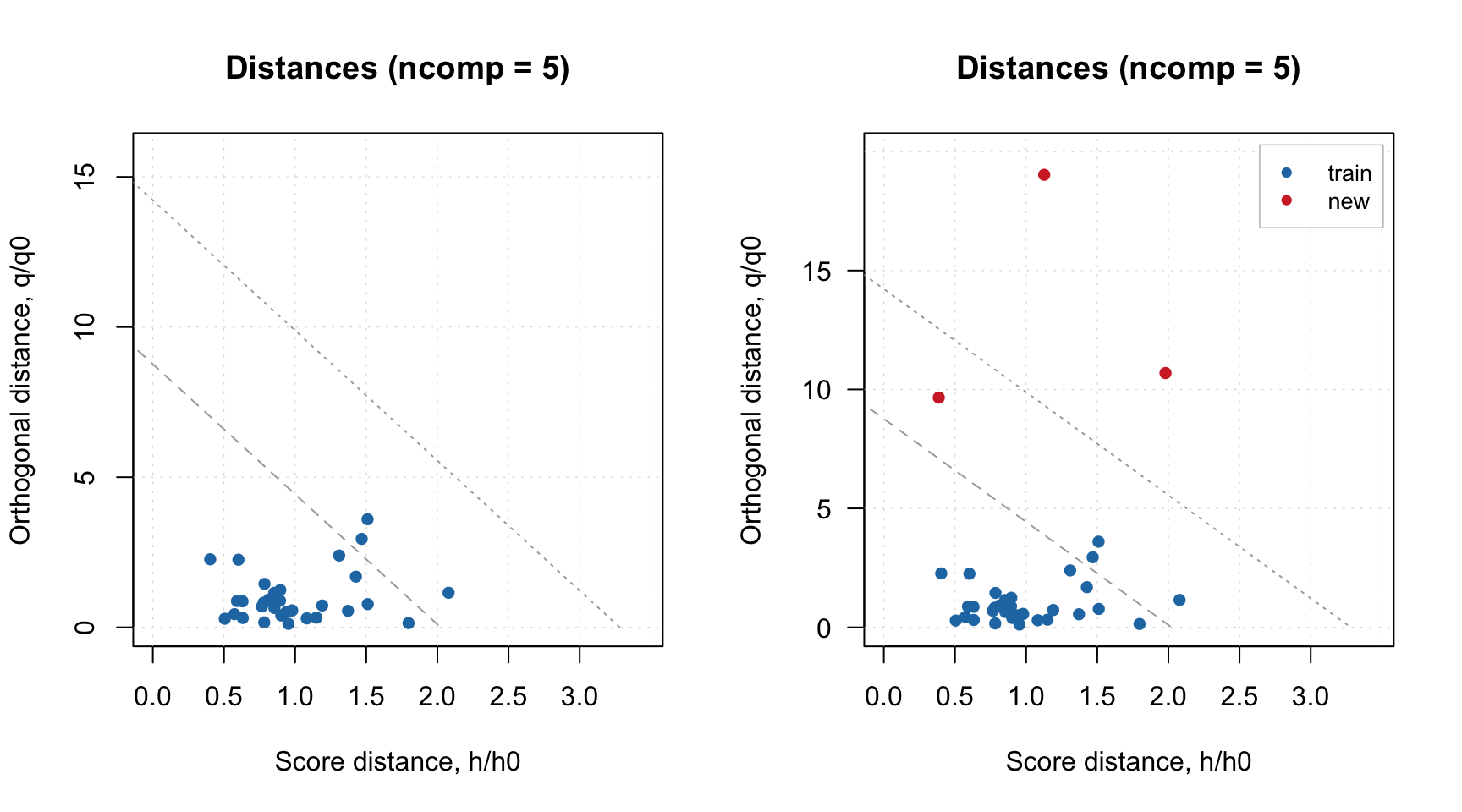
Finally, method plot() shows the four main PCA plots as a model (or results) overview.
You do not have to care about labels, names, legend and so on, however if necessary you can always change almost anything. See full list of methods available for PCA by ?pca and ?pcares.
Manual x-values for loading line plot
As discussed in the previous chapter, you can specify a special attribute, "xaxis.values" to a dataset, which will be used as manual x-values in bar and line plots. When we create any model and/or results the most important attributes, including this one, are inherited. For example, when you make a loadings line plot, it will be shown using the attribute values.
Here is an example that demonstrates this feature using PCA decomposition of the Simdata (UV/Vis spectra).
data(simdata)

# get the data matrix and add necessary attributes
X = simdata$spectra.c
attr(X, "xaxis.name") = "Wavelength, nm"
attr(X, "xaxis.values") = simdata$wavelength

# do PCA and show loadings plot for PC1 and PC2 as lines
m = pca(X, 3)
plotLoadings(m, 1:2, type = "l")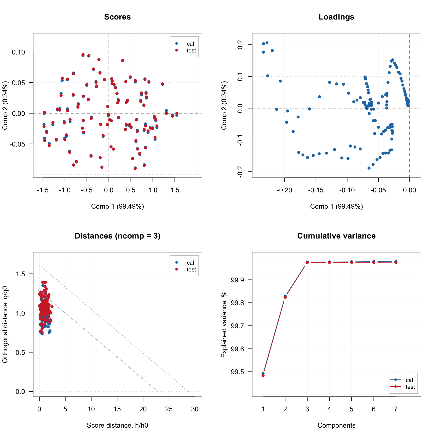
Excluding rows and columns
PCA as well as any other method in mdatools can exclude rows and columns from calculations when you train a model. For example, it can be useful if you have some candidates for outliers or do variable selection and do not want to remove rows and columns from the data matrix. In this case you can just specify two additional parameters, exclcols and exclrows, using either numbers or names of rows/columns to be excluded. You can also specify a vector with logical values (all TRUEs will be excluded).
The excluded rows are not used for creating a model and calculation of model’s and results’ performance (e.g. explained variance). However, main results (for PCA — scores and distances) are calculated for these rows as well and are hidden, so you will not see them on plots. You can always show values for excluded objects by using parameter show.excluded = TRUE. It is implemented via attributes “known” for plotting methods from mdatools so if you use e.g. ggplot2 you will see all points.
The excluded columns are not used for any calculations either, the corresponding results (e.g. loadings or regression coefficients) will have zero values for such columns and be also hidden on plots. Here is a simple example.
data(people)

m = pca(people, 5, scale = TRUE, exclrows = c("Lars", "Federico"), exclcols = "Income")

par(mfrow = c(2, 2))
plotScores(m, show.labels = TRUE)
plotScores(m, show.labels = TRUE, show.excluded = TRUE)
plotDistances(m, show.labels = TRUE, show.excluded = TRUE)
plotLoadings(m, show.labels = TRUE, show.excluded = TRUE)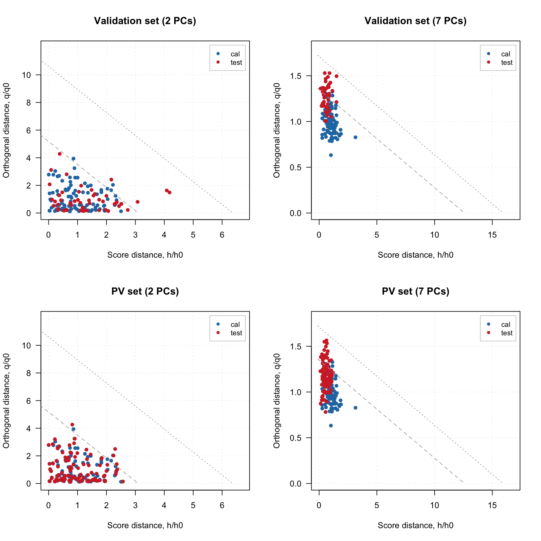
As you can see, the excluded observations (or variables in case of loadings plot) are either hidden completely or shown as gray points if show.excluded parameter is set to TRUE.
Here is the matrix with loadings, note that variable Income has zeros for loadings and the matrix has attribute exclrows set to 6 (which is a position of the variable):
##                Comp 1      Comp 2       Comp 3      Comp 4      Comp 5
## Height   -0.386393327 -0.10697019 -0.004829174 -0.12693029 -0.13128331
## Weight   -0.391013398 -0.07820097  0.051916032 -0.04049593 -0.14757465
## Hairleng  0.350435073  0.11623295 -0.103852349  0.04969503 -0.73669997
## Shoesize -0.385424793 -0.13805817 -0.069172117 -0.01049098 -0.17075488
## Age      -0.103466285 -0.18964288 -0.337243182  0.89254403 -0.02998028
## Income    0.000000000  0.00000000  0.000000000  0.00000000  0.00000000
## Beer     -0.317356319  0.38259695  0.044338872  0.03908064 -0.21419831
## Wine      0.140711271 -0.57861817 -0.059833970 -0.12347379 -0.41488773
## Sex       0.364537185  0.23838610  0.010818891 -0.04025631 -0.18263577
## Swim     -0.377470722 -0.04330411  0.008151288 -0.18149268 -0.30163601
## Region    0.140581701 -0.60435183  0.040969200 -0.15147464  0.17857614
## IQ        0.009849911 -0.09372132  0.927669306  0.32978247 -0.11815762
## attr(,"exclrows")
## [1] 6
## attr(,"name")
## [1] "Loadings"
## attr(,"xaxis.name")
## [1] "Components"
## attr(,"yaxis.name")
## [1] "Variables"
Such behavior will help to exclude and include rows and columns interactively, some examples will be shown later.
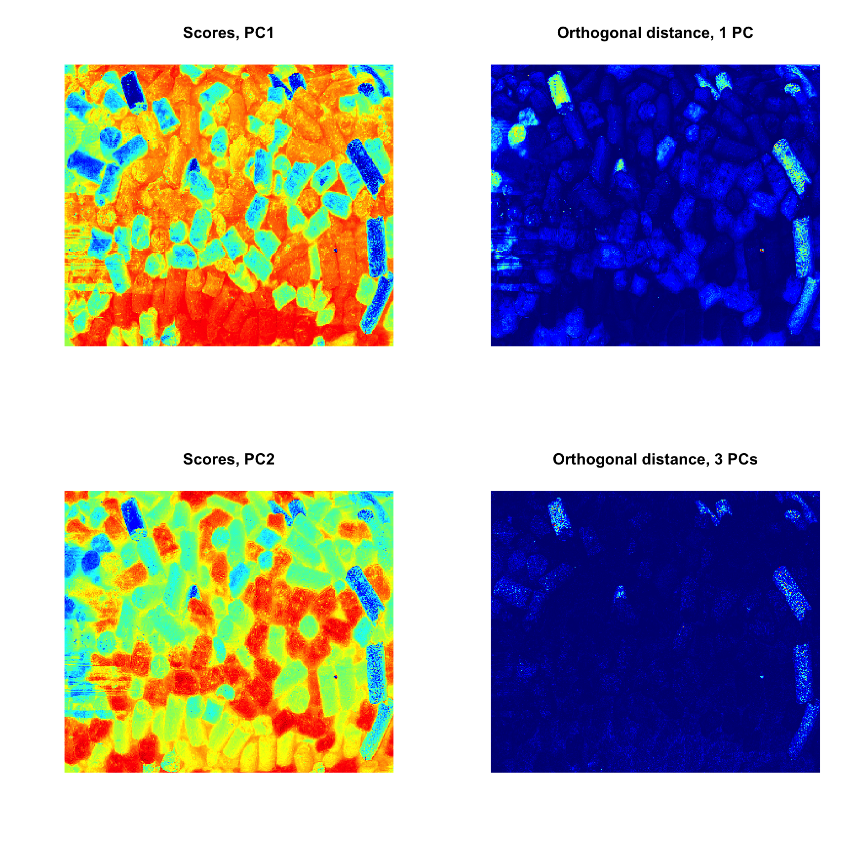
Support for images
As it was described before, images can be used as a source of data for any methods. In this case the results, related to objects/pixels will inherit all necessary attributes and can be shown as images as well. In the example below we make a PCA model for the image data from the package and show scores and distances.
data(pellets)

# convert image to data matrix
X = mda.im2data(pellets)

# apply PCA
m = pca(X)

# show PCA outcomes as images
par(mfrow = c(2, 2))
imshow(m$res$cal$scores, main = "Scores, PC1")
imshow(m$res$cal$Q, main = "Orthogonal distance, 1 PC")
imshow(m$res$cal$scores, 2, main = "Scores, PC2")
imshow(m$res$cal$Q, 3, main = "Orthogonal distance, 3 PCs")